A logo that computes itself: an E that converges in eight epochs
This is a build note about our own logo. The mark ships on e8.team and renders live in the browser, recomputed every frame. Its sister mark, the Vedana clover, set the pattern we extended here.
We needed a mark for Epoch8 in the family of Vedana’s, built the way Vedana was: the browser draws it from a live formula every frame, holding no saved picture. Two shapes carry the name. The 8 is a Bernoulli lemniscate, a figure-eight curve you get from one short formula. The E is a Fourier series, a shape you build by stacking spinning circles, each riding on the one before it. We add the circles eight at a time, and call each batch of eight one epoch of training. At low counts the letter wobbles at its corners. That wobble is the Gibbs phenomenon: the ripple a half-finished Fourier sum always leaves near a sharp turn. We kept it on purpose. The part that fought us was the stroke width, the thickness of the drawn line. Set in fixed points, it broke at small sizes: the strokes fattened and swallowed the gaps in the mark. The fix was to measure every width as a fraction of the letter’s own height.
Recap: the pattern from Vedana
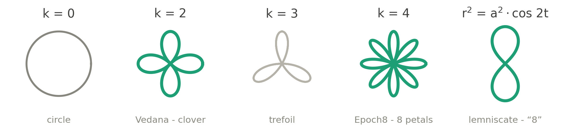
Vedana’s logo is not a stored drawing. It is a rose curve, the equation r = a*cos(2t), which traces petals around a center and is worked out fresh every time the page draws it. On hover it breathes between a clover at k=2 and a circle at k=0, where k sets the petal count. Under the hood it is one SVG with a single <path>. A loop recomputes that path every frame, and pointer handlers drive the hover morph. That is the grammar we wanted to keep: one live formula, one closed loop of a line, one thick stroke with round caps, and all the motion coming from a single number.

The brief for Epoch8 was a mark in that grammar with its own math, so the math had to earn the name. The name gives three hooks: the 8, the letter E, and epoch, which for a machine-learning company is a precise word, since an epoch is one pass of training.
Why a formula and not a drawing
The mark had to come out of a formula, so we hunted for the formula before we thought about style. A formula redraws at any size and never blurs, which is what a logo needs. Vedana already gave us a starting point: a rose curve at k=2. That k sets how many petals the curve grows. Step it up through whole numbers, k=1, 2, 3, 4, and one rose curve sprouts more and more petals. At k=4 it has exactly eight of them, a clean pun on the name. That was our first dead end.
Finding the 8
The eight-petal rose clogs its own center. At the line thickness a logo needs, those eight petals crowd the middle, and below about 24 px across they turn to mush. A logo also has to survive as a favicon, the tiny icon in a browser tab. A shape that only reads when it is large does not qualify.
The Bernoulli lemniscate, the equation r^2 = a^2*cos(2t), is the sideways infinity symbol; stand it upright and it reads as a clean figure eight. It carries a second meaning we liked: infinity is the sign of a cycle, and an epoch is one cycle of training. As the digit 8 it stays cleaner than any rose, so it became our 8.
Finding the E
A letter is harder, because no single tidy formula draws an E. We tried two near-misses first.
A Lissajous figure at a 3:1 ratio folds into a three-lobed shape you can almost read as an E. Almost. It still looks like a wave, so it failed as a letter.
An epicycloid, 9*cos(t) - cos(9*t), is a curve built on the prefix epi, with eight sharp points. A nice pun, but the shape is busy and hard to read. We parked it as a possible background pattern and dropped it as the mark.
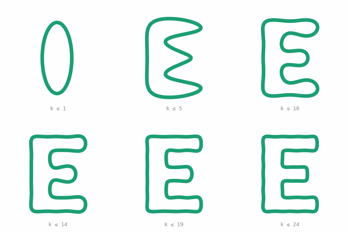
The answer was a Fourier series. Here is the idea it rests on: any outline that closes back on itself, the shape of an E included, can be redrawn by a stack of spinning circles. We drew the E we wanted, marked 1024 points along its outline, and ran a discrete Fourier transform (DFT): a standard step that reads those points and hands back the circles, in order of importance. The first few set the rough shape, and each extra one only adds finer detail. Draw just a handful and you get a blobby E; add more circles and it sharpens into a clean letter. That sharpening is the convergence. Each circle is one harmonic, so we counted them off in eights and called every eight one epoch: the first 8 harmonics are epoch one (rough), 16 is epoch two (sharper), and the E tightens up epoch by epoch, the way accuracy climbs over training. The clean mark sits at 160 harmonics. Because the E is now just a list of numbers, nothing is drawn and stored: the browser rebuilds the letter from the numbers every frame. In symbols, that stack of circles is z(t) = sum of c_k * e^(i*k*t).
The Gibbs ripple, and why we kept it
A half-finished Fourier sum never turns a corner cleanly. Right at a sharp turn it overshoots the true edge, and that overshoot does not fade to zero as you add circles. Its height holds at about 9% of the size of the corner’s jump; extra circles only squeeze it tighter against the corner. That is the Gibbs phenomenon, and it behaves like a training loss that keeps dropping but never quite reaches zero.
So we let the number of circles double as a set of stages. We build the mark inside a 400-unit box, and the line is 8 units thick, so 4 units sit on each side of its centerline. Any ripple shorter than those 4 units hides under the ink and stops mattering. The only question left is how many circles it takes for the overshoot to duck under the stroke and disappear.
- At 8 harmonics the overshoot is about 4.68 units, just past the stroke, and visible. Call it the proof of concept.
- At 16 harmonics it is about 2.11 units, tucked inside the stroke. The MVP.
- At 32 harmonics it is about 1.05 units, with a four-times margin. Production.
- At 160 harmonics it is about 0.21 units. Release, and overkill on purpose.
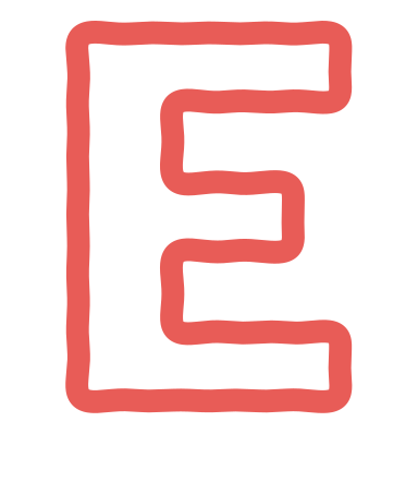
The metaphor holds because the math holds. The ripple is always there. You stop paying for harmonics when the eye can no longer see the seam.
What did not work, and why
Three things, in order.
The eight-petal rose. The obvious pun on the name, and the first idea everyone has. At logo weight the petals crowd the center and collapse at favicon size. The pun was not worth a mark that dies below 24 px.
The Lissajous and epicycloid E. Both gave a shape near an E from one clean formula, which was tempting. Neither read as a letter. A logo that needs a caption to be read as an E is just decoration.
The stroke width in points. This one cost real time. We first set the line thickness in points, the way you would in a drawing app. Points are a fixed size, though, and the mark is not. Shrink the mark and the letter’s height shrinks with it. A point-based line stays put, though, so it eats a bigger and bigger share of the letter. The strokes fatten and close in on the gap between the E and the 8. That gap should sit near 0.054 of the cap-height (the height of the capital E); at small sizes it fell to 0.029, and the mark looked cramped with no obvious cause. The fix was to drop points and pin every measurement to the letter itself, as a fraction of that cap-height. We read the point width off the drawing scale after the curve is laid out, so every redraw uses letter-relative strokes.
The geometry, in cap-height units
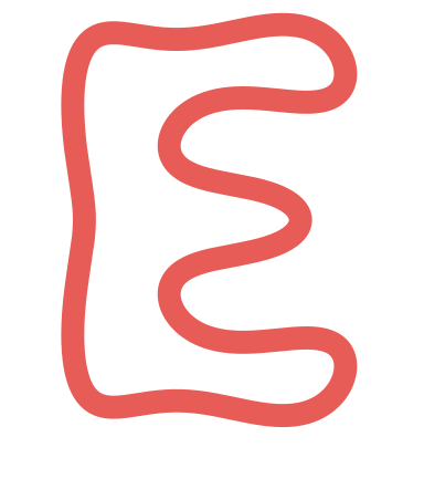
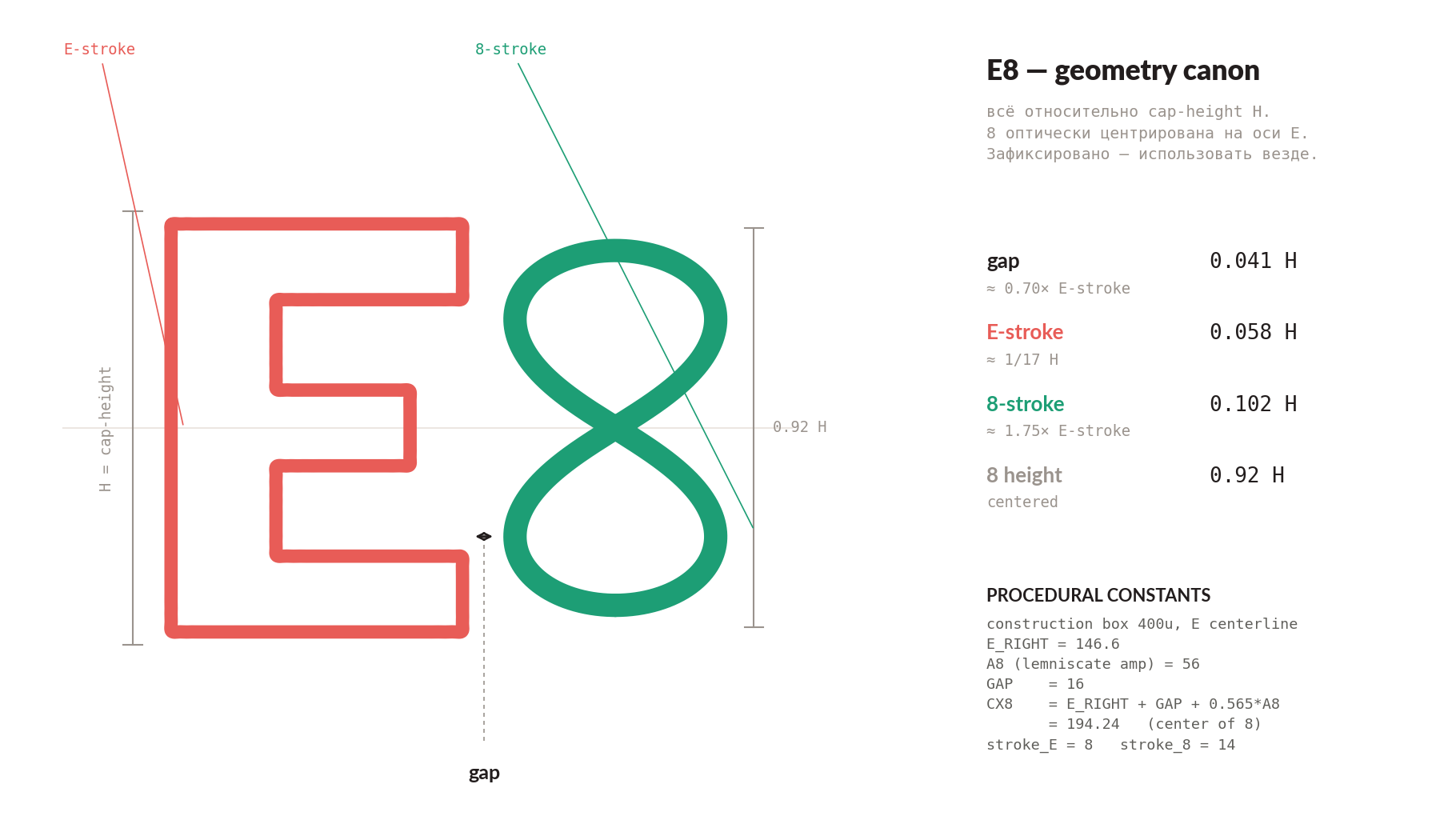
The stroke bug taught us the rule. Every measure in the mark is written as a fraction of the cap-height H, so the whole thing holds its proportions at any size. The gap between the E and the 8 is 0.041 H. The E stroke is 0.058 H. The 8 stroke is 0.102 H, which is 1.75 times the E stroke. The 8 stands at 0.92 H, optically centered on the E: placed so it looks centered to the eye. The E is drawn in coral, #E85C57, and the 8 in teal, #1D9E75, because they are two different objects: a Fourier sum and a lemniscate.
How it runs
The implementation follows the Vedana pattern. One <svg viewBox="0 0 400 400">, a single <path>, an animation loop that recomputes d each frame with an ease at the endpoints, and pointer handlers for the hover morph. The E is a runtime partial Fourier sum with a variable harmonic count, so the intro can grow it from a circle to the letter. The 8 is the lemniscate drawn as a parametric outline. On hover the mark breathes toward k=2, the Vedana shape, a small family handshake. All of it lives in a lib/fourier module: the transform, the contour sampler, the lemniscate, and the live mark.
The very engine that draws the logo also drives the budget estimator on the site. Drag its slider and the Fourier reconstruction runs live, rebuilding the E on a plain rule: one epoch is one week is one circle.
The wordmark, an 8 that already crosses
The mark needed a name beside it, so we had to pick a typeface. We are a shop full of programmers, so a monospace font was the obvious call: the fixed-width kind you stare at all day in a code editor, where every character takes up an identical slot. We tried a handful and settled on JetBrains Mono, and the detail that settled it was its 8. Most fonts build an 8 from two stacked ovals that meet in a soft pinch. JetBrains Mono in ExtraBold crosses it instead: the waist narrows to a sharp little beak, the beak a lemniscate makes where it crosses itself in the middle. Lay the typed 8 over the math one and the two crossings land on top of each other. So the wordmark’s 8 rhymes with the logo’s 8, one drawn by a type designer and one by an equation.

The stages, reused: a maturity map for proposals
The convergence ladder earned its keep off the logo too. When we scope a build in a proposal, it usually comes in stages. The first is a bare proof that the thing works; the last is a system that runs on its own. A staged build is easy to describe badly: the client hears five phases and cannot tell what changes between them. So we illustrate the stages with the mark itself, drawing each one as the E at a higher harmonic count. The early stage is the rough, low-harmonic E, blobby but already an E. The final stage is the crisp one. The client reads maturity as convergence: a letter you can recognize early, sharpening as it earns more of the work.
The ladder is also an argument. Each stage is useful on its own, so the client can stop after any one and keep what they have. That mirrors the math: a partial Fourier sum is already a readable E long before it is exact. One number usually runs through every stage, some measure of how much manual work is left, and its fall is the value. That leftover effort behaves like the Gibbs overshoot: it shrinks stage by stage without ever quite reaching zero, because a few exceptions always need a person.
What this adds up to
A procedural mark turns out to be a tiny machine-learning system in disguise. You pick your building blocks: the spinning circles. You fit them to a target until they match it: the letter E. Then you decide when close enough counts as done: that is the Gibbs call. The lesson that carries past a logo is the plain one: measure in the units that scale with the thing. Stroke width in points was the bug. Stroke width tied to the letter’s height was the fix. Every other measurement in the mark is pinned to the letter too.
If you want to see where this turns into a whole site, the e8.team procedural site case is the build it anchors.