
Traps in A/B testing: why a test shows nothing
A flat A/B test costs you twice: you kill a feature that worked, or you ship one that loses money without anyone noticing. Most of the time the problem is the measurement. The feature is fine. This is a catalog of the traps that make a test read as zero, or read as a win, when the truth is the other way. We walk through six families, each with the industry example it came from, how to spot it, and what to do.
Where this started: a retailer with on-site search. The team improved product ranking, and revenue in the A/B test did not move. They dug in. Almost all revenue came from a small set of popular products, and those were already found without any improvement. The change really helped, but only on rare, long-tail queries that barely show up in total revenue. The effect was there. They measured it where it could not appear.
“We found no significant effect” almost never means “there is no effect.” Far more often the effect was diluted, hidden, drowned in noise, leaked into the control group, or measured on the wrong number.
The traps fall into six families:
- The metric dilutes the effect: the effect is real, but the overall number hides it.
- Not enough sensitivity: the effect drowns in noise, or got measured over the wrong window.
- Errors in design and in how the result was computed.
- Leakage between groups: one group changes the other.
- Technical and real-life traps: logging bugs, short term against long term, new users against old.
- Interpretation traps: the number is read wrong.
The search case is itself four of these traps at once (1.1, 1.2, 1.3 and 1.5). Each family below is another angle on the same trouble.
Family 1. The metric dilutes the effect
The “search case” family: the effect is real, but the overall number does not show it.
1.1. The effect is measured on everyone, though the change reached only some (dilution)
What happens. Say only 10% of users actually see your change. The other 90% never see it, so their effect is exactly zero. Average across everyone and those 90% of zeros smear the effect of the 10% who had one. A large effect in a minority turns into a tiny average and drowns in noise.
A plain count from Spotify: if 10% of people really saw the change, and they gained 2 units of the metric, the average across everyone is 10% of 2, so 0.2 units. The cure is to measure the effect only on the people who could really see it, through what is called trigger analysis (you score only the triggered users). Averaging over everyone is what buries it.
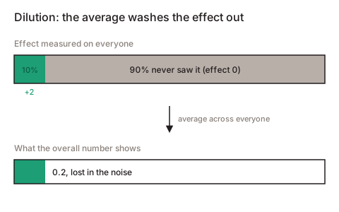
Example. The same rule at Kohavi (Microsoft): a 10% gain in a segment that is 1% of the audience shows up as about 0.1% overall. The classic case is weather queries on Bing: only people who asked about weather see a change in the weather answer, so the effect is measured on them and then carefully scaled back to everyone.
How to spot it. Look only at the affected users and the effect is there and clear. Look at everyone and it is empty. Another sign: far more people are “assigned” to the experiment than actually saw the change. In mobile and web apps the flag often flips at app start, so formally everyone is “in the experiment” though almost nobody reached the feature.
What to do. Log not “who was assigned” but “who actually arrived and saw it.” DoorDash reports that when they stopped counting the extra people, test sensitivity rose by tens of times (around 160 times in their case). Booking, by tightening the rules for entering an experiment, raised the share of truly affected people from around 25% to around 85%, and the test began to catch far weaker effects.
A second trap hides here. Once you narrow to the affected users, you are measuring the effect on a different group of people, and you cannot just multiply it back over the whole audience to size the money (the affected are systematically different: more active, younger, and so on). Spotify says plainly that such a result tells you the direction (“it got better”) but not the exact size at the scale of the whole product. And if the change itself affects who lands in the affected group (say it slowed the page, so the impatient left before they saw the feature), the groups stop being comparable. That is a frequent cause of SRM (see 3.5).
1.2. The metric is dragged by “whales”, a handful of heavy users
What happens. Money metrics like revenue and GMV (gross merchandise value, the total value of orders) are brutally uneven: a handful of people bring most of the money. So the metric jumps with their random behavior. Your change barely registers, and the test needs a huge number of people to see anything.
Example. eBay went through 174 real A/B experiments and found that fewer than 0.05% of users spend more than around €1,800, yet those people account for a fifth of all revenue. When the average rests on a few whales, their luck drives the metric: one of them spends a couple of thousand more or less this time and the whole result moves. In two thirds of the groups the spread was so wild that ordinary statistics (a t-test, the bootstrap) stop working: they need a finite “typical deviation”, and a tail like that has none.
The obvious cure is to trim the top, called winsorization (count anything above, say, €1,800 as exactly €1,800). But then the answer starts to depend on where you drew the line, and the confidence intervals come out misleadingly narrow.
How much this decides a test is clear at Shopify. On a heavily skewed money metric, an ordinary test caught a real effect in only about 4-6% of cases, so it almost always showed a false zero. Switch to a trimmed mean (drop a few percent of the most extreme values) and the same effect was caught in around 65% of cases. On a metric like revenue per visitor (zero for most, large sums for a few), sometimes even a million observations were not enough for the standard formula to start computing correctly.
How to spot it. The average follows the top 0.1-1% of users. Trim the top and the spread drops sharply. The effect estimate jumps depending on where you trimmed. The revenue confidence interval is huge, while simple metrics (conversion, clicks) move cleanly.
What to do. Trim or compress the tail (and say plainly that the metric you report is the trimmed one). Compute in logs. Cut variance with CUPED and post-stratification (ShareChat reached the same precision with around 45% less traffic on such metrics in ranking).
1.3. There is nothing left to move: the metric hit a ceiling
What happens. If the affected people are already near the maximum, there is nowhere to improve, good change or not. That is exactly the search case: popular products are already found, and no amount of search improvement lifts revenue on them. It is already at the ceiling.
Example. A clean “we failed the test because of a ceiling” case with a neat label is hard to find in industry. The nearest is Microsoft Teams: their “time in app” metric turned out to be deaf (supporting metrics caught a real effect, this one did not). The best ceiling example is the search case itself.
How to spot it. The affected segment’s metric is already near the maximum. The effect shows up where there was room to grow (a low base) but not overall.
What to do. Take a metric that has room to grow for the affected people. Slice by base level and look for the effect where there was headroom (in search, that is the rare, long-tail queries and products).
1.4. You look at a number too far from the change (a proxy)
What happens. Turn a small screw at the start and read the result at the very end of a long chain (revenue, retention) and the signal has to pass through a pile of noisy intermediate steps. Such a metric is too slow and noisy to catch a change in the couple of weeks a test runs, even when the change is genuinely good.
Example. Microsoft frames it as metric sensitivity: how much power the test has, and how prone the metric is to move at all. Sometimes power is fine but the metric barely ever moves by nature, so it is useless. The advice is to take a metric closer to the change (but verified that it pulls the real goal along, otherwise you cheer a proxy gain that is not real).
How to spot it. The chosen metric has a huge minimum detectable effect compared with what the feature can really deliver. Intermediate metrics move while the top-level one stands still. History shows this metric almost never moves in any experiment.
What to do. Take a metric closer to the change, checked in advance that it ties to the real goal. Keep the long-term metric as a guardrail (a safety metric you watch but do not optimize). Do not make it the main count.
1.5. Search and recommendations: all the revenue is in the “head”, the gain is in the “tail”
What happens. In search and recommendations both queries and products follow “few popular, many rare.” A handful of popular queries and products bring almost all the revenue, and they are already found well. A ranking improvement falls almost entirely to rare queries and niche products, where each one earns little. In total revenue, ruled by the unchanged head, the effect is invisible. This is dilution (1.1), ceiling (1.3) and heavy tail (1.2) at once.
Example. Spotify explains: in a well-tuned system a change usually reorders results for only some queries, and on most queries the results are identical in both groups. On those identical queries the effect is exactly zero, and they only dilute the picture. The fix is to compare the groups only where the results really differ, called counterfactual logging. The mirror case (Kohavi): a new module on a page can show great CTR (click-through rate, the share of views that click) but just pull clicks from elsewhere, a local win that sums to zero across the page.
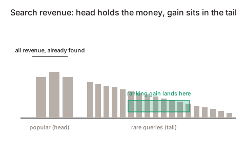
How to spot it. Revenue is gathered in a few products or queries. On popular queries both groups return the same thing. Offline ranking-quality metrics rise on the tail while online revenue stands still.
What to do. Slice by frequency (popular against rare) and look at the tail separately. Score only the queries where results really changed. For ranking, use interleaving (show one user a blended list from both variants), which is far more sensitive than an ordinary split.
Family 2. Not enough sensitivity
The effect is there but drowns in noise, or got measured over the wrong window.
2.1. The test is too small to catch the effect
What happens. A test has a sharpness of vision: the smallest effect it can make out, the minimum detectable effect (the smallest change the test can prove at your chosen size). If the real effect is smaller than that, the test physically cannot show significance, however hard it tries. “We found nothing” was decided in advance. One detail matters: to catch an effect half as large you need four times as many people (per the CUPED work, catching 0.5% needs about 100 times more users than catching 5%).
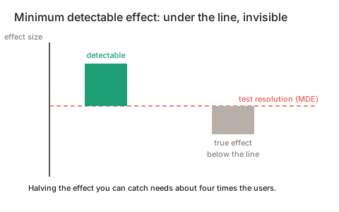
How to spot it. Nobody computed the needed sample size beforehand. The test was switched off “because it is not moving.” The confidence interval comfortably holds both zero and a clearly meaningful gain. That last one is the sign of “we did not reach the size”, not “there is no effect.”
What to do. Compute the needed sample size before launch. Show the full confidence interval, more than a bare “significant or not.” If the interval covers plausible gains, the verdict is “unclear, need more data.” Calling it “no effect” is wrong.
2.2. The metric is too noisy, and why the usual trick fails on revenue
What happens. Because money metrics spread so widely, a real gain can stay invisible for the whole test: a false zero from noise alone, with the effect still there.
The main subtlety. There is a popular noise-cutting trick, CUPED: take a user’s pre-experiment data and subtract their “usual level”, leaving only the change. On Bing metrics it cut the spread by about half, so the same precision with half the people. But on revenue it barely worked (under 5% of the effect), because a user’s past revenue predicts their future revenue poorly. So on the most important metric the standard cure helps least. Netflix is similar: on tenured users the spread cut to around 40%, on new ones little, because there is nothing to know about them in advance.
A trap inside the cure. CUPED uses pre-experiment data, the part the change cannot have touched. Use something already affected by the change by mistake and you can flip the sign of the result entirely.
How to spot it. The metric’s spread rests on a few people. The revenue interval is huge while a proxy (conversion, clicks) moves cleanly.
What to do. Take a more sensitive proxy as the deciding metric. Compress the tail first, then apply CUPED. Do not expect CUPED to rescue revenue in particular.
2.3. Novelty and habituation: an early reading lies
What happens. Two opposite stories. Novelty: the new thing is interesting just because it is new, people poke at it, a spike, then it fades, so an early reading overstates the effect or paints a fake win. Habituation: people first fumble with the new thing and do worse, so an early reading understates a good feature, and it gets killed before people adjust.
Example. Netflix calls this the “change effect” and so tests on new users, who have no old habit to break. The typical novelty shape: a big effect in the first week that melts each week after.
How to spot it. Plot the effect by week. If it creeps down (novelty) or up (habituation) and does not hold flat, there it is. Split into new and returning users.
What to do. Run the test until the effect settles. Look at new users separately. For long-lived features, use a long holdout.
2.4. The test did not cover a full week
What happens. People behave differently on weekdays and weekends, at the start of the month and on payday. Run a test from, say, Tuesday to Thursday and it caught an unrepresentative slice of the audience, and the effect is mixed up with which days fell in the window. Sometimes that alone reads as a zero, because the segment of people you needed barely showed up in those days.
What to do. Run at least one full week, ideally one to two, and in whole-week multiples so every day is weighted evenly. Ramp gradually (for example 1%, then 5%, then 25%, then 50%, then 100%, as Booking does) and finish the ramp before measurement starts. Do not launch across big holidays and sales, and tag abnormal days and check the result does not rest only on them.
2.5. A suspiciously large early result is usually false (Twyman’s law)
What happens. Twyman’s law: “any figure that looks unusually interesting is probably wrong.” A huge early effect is more often a logging bug, a broken test or chance than a breakthrough. When it later deflates to normal, the team concludes “not confirmed”, a false conclusion in both directions.
Example. At Bing real breakthroughs happen about once in 500 attempts. At that rarity, even a “breakthrough that looks real” is true only in about 3 cases out of 100. A real but surprising win (a color change brought more than around €9M a year) was re-checked by re-running on 32 million users before they believed it.
What to do. Set up “too good to be true” alerts. Always check SRM first (3.5). Re-run surprising wins to confirm.
Family 3. Errors in design and in summing up
3.1. Peeking: you stopped the test the moment it turned “significant”
What happens. An ordinary test holds up under one condition: you decide in advance how much data to collect and check the result once. Peek every day and stop the moment “significant” pops up and you are effectively catching a random spike. Each new look is another chance for noise to cross the line by accident.
Important: the problem is not that you look, it is that you act on what you saw. If the sample size is fixed in advance and the decision is taken only at the planned end, you can stare at the dashboard all you like. It does not affect the error rate. The guarantee follows the stopping rule, and your eyes do not enter it. The sin is stopping on what you saw: you saw “significant” and switched off, or “almost there” and extended a week, or peeked and changed the metric or segment. Asymmetry counts as a violation too: if you would stop on a pretty result but extend on an ugly one, that is selection, even without a formal early stop. So “do not peek” is really a short insurance against temptation: looking is harmless, but the hand reaches to stop. (The exception is an early stop for safety, when a feature clearly harms users, done deliberately, because user welfare beats statistical purity.)
Example. Evan Miller: check after every visitor and stop at the first “significant” and false positives climb to around 26%, well above the promised 5%. Optimizely on dummies (A/A, where there is no difference at all): looking after every visitor gives around a 57% chance of falsely declaring a winner, every 500 around 26%, every 1000 around 20%.
What to do. Either fix the sample size in advance and check once, or use sequential statistics built for repeated looks.
What that means in plain words: ordinary statistics hold under “looked once.” Sequential testing works differently: you can look every day, because it charges a price for the right to peek. The more often you look, the higher the significance bar climbs, and a “win” is declared only when the evidence is truly large (not when noise jumped once). So the error stays at most 5% for any number of looks, and you can watch the test in real time and stop early once the result has built up.
Technical names you might meet: always-valid p-values (a p-value you can look at any time) and mSPRT (a method that accumulates evidence and crosses the line only when the lead is stable). This is built into Optimizely, for example. Other platforms call something similar sequential testing or group-sequential.
3.2. Many metrics and segments: something fires by chance
What happens. A 5% significance threshold means that even with no effect at all, the check still shouts “significant” by chance about 1 time in 20. That is the price we agreed to pay for one check. But there is rarely one check. Every combination of “which metric times which audience slice (iPhones, a country, newcomers) times which variant” is a separate check, a separate roll of the dice. Make twenty rolls on empty ground and one or two “significant” results show up almost for sure, by probability alone. You see them and decide you found a win, though it is noise.
A separate worse case is choosing the slice after looking at the data (“overall zero, oh, but it worked on iPhones”). That is no longer a hypothesis test but fitting to whatever happened to jump. Significance in such a slice means nothing: you eyeballed the options and picked the prettiest.
Example (and why “wrong 10% of the time” left 50% junk). Optimizely walks through a case: 5 variants times 2 goals is 10 checks, of which, say, only one really works. Suppose each empty check is falsely declared a win 10% of the time, which sounds small. But there are nine empty checks, so on average one still pops. That gives two declared winners: one real and one fake. So half our “wins” are junk, though we were wrong in only 10% of checks.
That is the main surprise: “how often we err on one check” (10%) and “what share of our declared wins is fake” (50%) are very different numbers, and the second is far scarier. When Optimizely turned on a correction that controls the second, the number of declared winners dropped by about 20%: the fakes fell away.
What to do. Pick one main metric in advance and a short fixed list of the rest, and do not breed checks. Put a multiple-comparisons correction on the rest. Two to choose from:
- Bonferroni, blunt and strict: it raises the bar by however many checks you have (10 checks means we demand 0.5% per check, down from 5%). Reliable but stifling: at many checks almost nothing passes.
- Benjamini-Hochberg (FDR), smarter and gentler: it watches not “any single random error” but the share of fakes among declared wins, kept below, say, 5%. At scale (many metrics) this is what gets used.
And firmly: a slice found after the fact is only a hypothesis. Test it with a separate, fresh experiment aimed at that slice.
3.3. Simpson’s paradox: treatment is better every day, yet worse in total
What happens. Sometimes within each subgroup variant B is better, yet in the total it is worse. That happens when the subgroups are weighted unevenly. The classic cause in A/B is ramping during the test: B’s share grows, so later days (weekends, say, where everyone’s metrics are lower) get a disproportionately large weight in group B and drag its average down.
Example. Kohavi & Longbotham (2011): in total treatment came out around 4% worse than control, though by day it was better almost every day. The reason: the first 26 days it ran on 1% of people, then a week at 5%, and the last two days at 50%. Those two days were a weekend, so they outweighed everything.
What to do. Hold the group shares constant across the whole measurement window: finish the ramp before measurement starts. If you did ramp during the test, compute by day. A single lumped average hides it. This is Simpson’s paradox.
3.4. The unit is mixed up: you split by person but count by clicks
What happens. You assign people to groups but count the result by clicks or sessions. The snag: one person’s clicks resemble each other. Someone who likes the feature clicks a lot and all one way, someone who left does not click at all. So a hundred clicks from ten people are not a hundred independent opinions but ten. The standard formula treats each click as a separate independent observation, so it thinks it has far more data than it does.
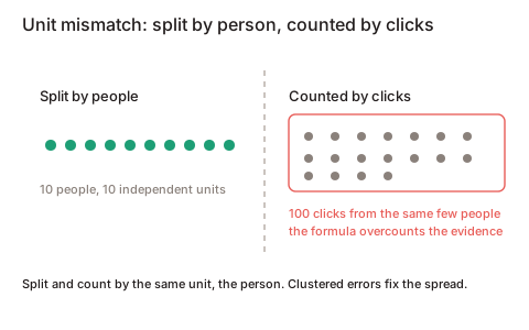
How this bites: the formula decides it has piles of evidence and understates the spread, drawing too-narrow confidence intervals and shouting “significant” on empty ground too often.
Example. Kohavi & Longbotham ran a real test as a dummy (A/A, no difference) 6000 times. Where observations were truly independent, false significance came up at the proper around 5%. Where clicks belonged to the same people, it came up in around 30% of cases, because the formula understated the true spread by two thirds. Every third “conclusion” would be a fake.
What to do. The main rule: split into groups and count the result by the same unit, by people (then independence holds and the formula does not lie).
If the metric is by nature “per session” or “per click” (for example CTR, clicks over views), correct the spread so the independent unit is the person and the click no longer counts on its own. Three working ways:
- Clustered standard errors, the most direct: compute the spread with all of one person’s actions grouped into one bundle. The formula then sees as many independent units as people.
- Bootstrap, “resample many times”: repeatedly draw whole people at random, with all their clicks, and watch how the result wanders from resample to resample. The real spread shows directly, with no formula to lie.
- The delta method, a correction formula for ratio metrics (clicks over sessions and the like): it recomputes the spread of a ratio of two quantities measured at different levels.
3.5. SRM: the group shares drifted apart, so the test is broken
What happens. SRM stands for sample ratio mismatch. You set a 50/50 split, but the groups came out, say, 48/52. Seems minor. But with random splitting and many people, the shares should land almost exactly. A visible skew means something broke in the pipe: group assignment, variant delivery, logs, filters, or a human intervened.
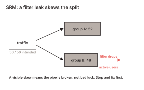
Why it kills the result. If something selectively added or dropped people from one group, that “something” is almost surely tied to the metric too. So the groups are no longer comparable: the difference you see may be the breakage talking, with your change set aside. SRM is like a temperature: not a diagnosis in itself, but a sure sign that the numbers cannot be trusted yet, fix first.
Why even 50.2/49.8 is an alarm. You check with a simple test (chi-square): it computes how likely such a skew is by pure chance. On millions of users, even a 50.2/49.8 split can be so unlikely by chance (one in hundreds of thousands) that it is not “a little bad luck” but “something really broke.”
Example. Microsoft finds SRM in about 6% of experiments, LinkedIn in about 10% of analyses. A real MSN case: a new carousel showed less engagement, and SRM. They dug in: the most active users in the feature group clicked so much they looked like bots, and the anti-bot filter dropped them from the count, after they had seen the feature. So the best users were removed from that group, and it “sagged.” Fix the filter and the result flipped, and the feature shipped as a win. Another frequent SRM cause is a redirect in one group: the extra latency plus bots handled differently, and the group steadily loses.
What to do. Auto-check the split on every test, and until the shares agree, draw no conclusions (this is the first thing you look at, before metrics). Redirect both groups the same way. Decide on bots and filters at the moment of first exposure, never after the fact, so the filter does not drop people once they have already seen the variant. If the shares still do not agree, restart.
Family 4. Leakage between groups
An ordinary A/B rests on an assumption it rarely states out loud: what you showed a person affects that person, and not a neighbor in the other group. The groups are treated as isolated. Sometimes they are not: what happens in group B flows into group A. Then the control group stops being a clean “how it would be without the change”, because it is itself partly infected by the effect. The difference between groups either collapses (the feature looks dead) or balloons.
Leakage, called interference, comes in two kinds:
- through people: social ties (messages, the feed, reshares), where a feature on one person changes their friends’ behavior;
- through a shared resource: a driver pool, an ad budget, a shared cache or a shared model, where the groups compete for the same thing.
(Kohavi-Tang-Xu give this a whole chapter.)
4.1. Network effect: a feature on one person changes their friends’ behavior
What happens. You give the feature to group B. A person in B, because of it, posts and reshares more, and their friends see it, and some of those friends sit in group A. The control group is “infected” through the network, the difference between groups collapses, and from the outside the feature looks useless.
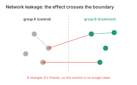
Example. LinkedIn does this: cut the whole user network into 10,000 “communities” (dense circles of friends) and compare two ways to split people into groups, the ordinary one (by single person) and one by whole communities, called cluster randomization. In one experiment the leakage-free estimate (by community) came out at 0.81, and the ordinary one at just 0.24. So the ordinary test saw less than a third of the real effect. Their warning: this way you can decide “the new algorithm gives nothing” and stop investing in it, though it works, the benefit just spread across the network and went unmeasured.
Why splitting by community helps. If a whole circle of friends lands in one group, the “infection” stays inside the circle and does not flow into the other group. You draw the group borders where there are few links between people.
What to do. Split into groups not single people but whole graph communities. At minimum, run both split methods side by side to at least detect the leakage: if the estimates diverge, it is there.
4.2. Marketplace: the groups fight over one warehouse
What happens. In a marketplace both groups draw from one limited stock: drivers, listings, couriers. If the feature makes buyers in group B order more, they grab drivers that would have gone to group A. A gets artificially worse. Nothing was withheld from A, B simply took it all. The “B minus A” difference balloons, and the buyer-side test overstates a benefit that will not exist at full rollout: when the feature is on for everyone, there is no neighbor left to take from.
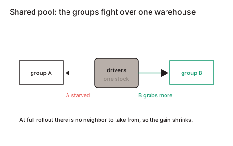
Example. Airbnb measured this skew with an “experiment over experiments”: at least 20% of the measured effect from an ordinary split was leakage distortion (32.6% in an early version of the work). The rest was the real effect. DoorDash (three sides there: customers, couriers, restaurants) describes “a choice among three evils”, each design with its own downside:
- switchback: turn the feature on for a whole region in time chunks (with it, then without, alternating). Almost no leakage, because at any moment everyone is in one mode. But it misses learning effects, which is when the system or couriers adapt to the feature over time.
- splitting by courier: sensitive, and learning shows, but strong leakage, since treatment and control couriers still fight over the same orders in one city.
- splitting by city: no leakage and learning shows, but little power, because cities are few, so “independent units” are a handful.
An important power detail: in such designs power depends on the number of chunks (cities, time windows) and not on the number of orders. A million orders in three cities is statistically almost “three points.”
What to do. Switchback, splitting by city or region, synthetic control (compare a city with the feature against an artificial “twin” built from several similar cities). Compute the error with a correction for chunks (clustered standard errors, see 3.4). Switchback has its own downside: leakage at the seams of time windows and at region borders.
4.3. Cannibalization: group B “ate” the shared budget
What happens. A common special case of 4.2. If the groups share one finite resource (an ad budget, a number of impressions, a warehouse), group B can look better only because it ate more of the shared pie. Its effectiveness has nothing to do with it. At full rollout, where the budget is one for all, there is no one to take from, and the gain zeroes out.
Example. DoorDash splits the campaign budget into two isolated wallets, called budget-split: a budget of around €180 became €90 to group B and €90 to group A, and each lives in its own universe and does not touch the other’s money. There is no more competition for budget between groups, and test sensitivity comes out 6-7 times higher than switchback. The method came from LinkedIn: it gives more than a 15-fold power gain and removes the distortion from fighting over budget, which could reach 230% of the effect size, so the distortion was several times larger than the effect being measured.
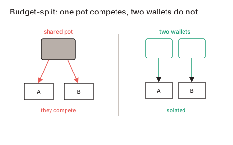
What to do. Separate wallets: an isolated budget per group. And measure the overall result as the sum of both groups. One group’s share grows just because it took from the neighbor.
4.4. A shared resource: one cache or one model across both groups
What happens. Groups can silently share a technical thing: a cache, a rate limiter, a recommendation pool, or a model retrained on both groups’ data at once. Then group B’s behavior changes that shared resource, and it changes group A’s results.
Example. If a recommendation model is retrained on the mixed data of both groups, the variants start to “feed” or “poison” each other through shared data, and the skew is often asymmetric, and it is unclear even who it favors. The cure is to train separate models on each group’s separate data.
How to spot it (for all of Family 4). The effect estimate changes markedly when you move from splitting by people to splitting by region or time. The control group’s metrics drift exactly when you ramp treatment. The result does not reproduce when groups are served by physically different models or caches.
Family 5. Technical and real-life traps
5.1. Logging bug: clicks “rose” though there were none
What happens. Clicks on the web are often counted like this: on a click the browser sends a tiny beacon request to the server. But when a person leaves the page, the browser cancels unsent requests. So anything that delays the leave (an extra script, opening in a new tab in place of navigating) lets the beacon get sent in time, and the logs show more clicks, though people clicked the same amount. The rise is a logging artifact, with no real engagement behind it.
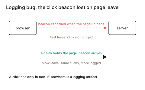
Example. Microsoft: in Safari more than half the click beacons were lost. A diagnostic hint: Internet Explorer did not lose beacons, so if the “click rise” sits only in non-IE browsers, it is almost surely a logging artifact. In general a different effect in different browsers is a yellow flag that the instruments are the problem and the feature is fine.
What to do. Add a watchdog metric for click loss by group. Slice everything by browser. Treat surprising wins as suspect until re-checked.
5.2. Short term and long term point opposite ways
What happens. A change can move a short-term metric the opposite way from the long-term good. Worsen the results and people search longer and click more ads, so short term there are more queries and revenue, while long term people leave and bring less over their lifetime.
Example. A Bing bug with bad results gave around +10% queries and +30% revenue per user, exactly the wrong signal. Speed experiments: every 100 ms faster is about +0.6% revenue; 250 ms of delay about -1.5%, 500 ms about -3%; at Google 100-400 ms of delay is about -0.2 to -0.6% of searches; at Amazon (per Greg Linden) 100 ms is about -1% of sales. The lesson: a roughly built “experimental” implementation can sink a good feature by its added latency alone. After the long-term work, Google cut ads on mobile results by half. Another trap: if unhappy users from group B leave, a long test keeps the surviving happy part, and that distorts or flips the result.
What to do. Take a metric that predicts the long-term good (Bing uses “sessions per user”). Run long holdout measurements carefully. Measure latency with a separate speed experiment.
5.3. The effect differs for new and old users
What happens. Old users have a habit of the old interface (the new one bothers them at first), new ones do not. Average across everyone and the real, stable effect washes out.
Example. Microsoft advises measuring the long effect on the last two weeks of a 10-week test, a fair mix of adjusted old users and recently arrived new ones, who react differently. Netflix computes the main metric separately on new users to remove novelty and habituation effects.
What to do. Slice by tenure. Compute the main metric separately on new users. Run the test until it settles. For long tests, measure on the last window.
5.4. The winner’s curse: you picked the best and it deflated
What happens. A significance threshold works as a filter: in a noisy or small test only randomly large results pass it. So the published number is systematically overstated. And if you also pick the “best” variant or “best” segment from many, the overstatement grows, and on a repeat it deflates.
Example. Gelman & Carlin: at low power a significant result can be exaggerated (about 9-10 times in their example) and can also have about a 24% chance of the wrong sign. Airbnb built a correction for this bias into their reporting framework, because if you ship only “winners”, their combined effect is systematically overstated. This is the winner’s curse.
What to do. Trust the size of an effect only with enough power. Fix the main metric and segment in advance. Shrink estimates (shrinkage) and re-check surprising wins by re-running.
5.5. An A/A failed: randomization is broken or an “echo” of a past test
What happens. An A/A test shows both groups the same thing. There should be no difference (significance around 5%, and that by chance). If A/A fires more often, something is broken: randomization, the metric or the pipeline. A frequent cause is “echo” (carryover): the same people are reused from a past experiment without reshuffling.
Example. Kohavi: metrics unrelated to the change suddenly moved significantly, they re-ran, and the effects vanished. Group reuse was to blame. The echo held for around 3 weeks, and after a test with a “very bad experience” the groups had not recovered even after 3 months. A separate case: a variant that merely set a cookie (a useless random number), on around 20 million users, showed all metrics crash in IE8/9, because writing the cookie in that browser overwrote other cookies, reshuffling people, and it looked like churn. A pure technical artifact that buried the feature.
What to do. Run A/A continuously. Auto-check SRM on every test. Reshuffle people fresh for each experiment. Keep a separate control per experiment. Let reused groups “rest” until the echo is gone.
Family 6. Interpretation traps
6.1. Segments cancel each other: zero on average, strong effect underneath
What happens. A change can be a strong plus for some and a minus for others. On average that gives about zero, and the team concludes “no effect” and kills the feature. The average just hid two opposite effects.
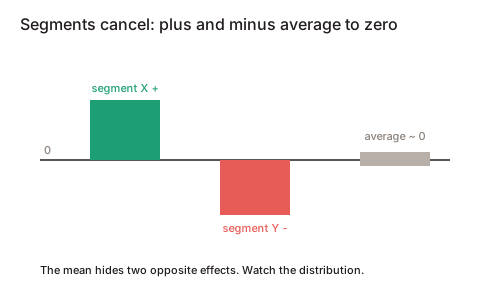
Example. Netflix looks for these on purpose: “a homepage redesign can give more sign-ups in one country and fewer in another; some like push, some like email.” The average misleads here.
What to do. Pick key segments in advance (not after the fact). Look at the distribution of effects, well beyond the average. In place of “ship to all or none”, consider a targeted rollout to those it helps.
6.2. “Found no effect” is not “proved there is no effect”
What happens. “Not significant” is often read as “proved the feature does not work.” These are different things. In ordinary statistics you never “prove absence”, you just did not find enough evidence. And in a small test there is almost never enough.
Example. Google reported “no significant effect”, and Microsoft with a more powerful test (via CUPED) found the same effect. So someone else’s “no effect” was just a lack of power.
What to do. Look at the width of the confidence interval. Compute power in advance. To say “no effect within plus or minus this much” with proof, use an equivalence test (TOST). A large p-value alone does not show it.
6.3. Optimizing the wrong number (a bad OEC)
What happens. If the test’s main metric is short and easy to game (clicks, queries, immediate revenue), you can “win” by doing things plainly bad for the business. Clicks are not satisfaction. One module’s CTR is not value for the whole page (clicks may have just flowed in from elsewhere).
Example. That Bing bug (+10% queries, +30% revenue from worse results) proves that “queries per user” and “revenue per user” are bad main metrics: if we worshiped them, we would worsen quality on purpose. Bing measures “sessions per user” instead. Booking: “model quality is not the same as business value”; gaming a proxy metric does not turn into the business result you want, and you must check with a real business-metric experiment. The metric you choose to win is the OEC (overall evaluation criterion, the single number a test is judged by).
What to do. Build the main metric around long-term value (repeat visits, retention). Tie the “success metric” to a guardrail on quality. Check by business result, never by a proxy.
Cheat sheet: what you saw in the data, which trap
| What you see | Likely trap | Section |
|---|---|---|
| On affected users the effect is there; on everyone it is empty | Dilution | 1.1 |
| The estimate jumps with where you trimmed the tail; the revenue interval is huge | Heavy tail (“whales”) | 1.2 |
| The affected segment’s metric is already near maximum | Ceiling | 1.3 |
| Intermediate metrics move, the top one stands still | Metric too far away | 1.4 |
| On popular queries both groups return the same; quality rises, revenue does not | All revenue in the “head” | 1.5 |
| The interval holds both zero and a meaningful gain | Test too small | 2.1 |
| CUPED barely cut noise on revenue | Noisy revenue | 2.2 |
| The effect by week creeps down or up | Novelty / habituation | 2.3 |
| The effect jumps by day of week | Partial week | 2.4 |
| ”Significant” appears and disappears day to day | Peeking | 3.1 |
| A few green metrics out of dozens | Many checks | 3.2 |
| B is better each day, worse in total; traffic share changed | Simpson’s paradox | 3.3 |
| A/A fires more than 5% on “per session” metrics | Unit mixed up | 3.4 |
| The split came out not 50/50 | SRM (broken test) | 3.5 |
| The estimate changes when splitting by region or time | Leakage between groups | 4.1-4.4 |
| Click rise only in non-IE browsers | Logging bug (beacons) | 5.1 |
| Short term and long term point opposite ways | Short against long term | 5.2 |
| The effect differs for new and old | Tenure difference | 5.3 |
| A surprising win deflates on rollout | Winner’s curse | 5.4 |
| ”Unrelated” metrics move; on re-run the effect vanished | Echo of a past test | 5.5 |
| Average zero, but segments fly apart into plus and minus | Segments cancel out | 6.1 |
| ”Not significant” read as “no effect” | Not found is not none | 6.2 |
| The winning metric can be lifted by an obviously bad change | Wrong main metric | 6.3 |
Checklist: before you believe a test result
Go top to bottom. In brackets, the section to dive into if a point “lights up.” You do not have to answer “yes” to all, but every “no” should be understood.
0. Before launch (design)
- One main metric chosen in advance and a short fixed list of the rest, no breeding checks on the fly (3.2, 6.3)
- The main metric is close to the change and can really move, not “revenue out of habit” (1.4, 6.3)
- Sample size and MDE computed: the test can in principle catch the expected effect (2.1)
- You split and count by the same unit (usually by people) (3.4)
- Decided how to count “affected” (exposure logging), so you do not measure the effect on those who never saw the feature (1.1)
- Leakage risk assessed (social ties, shared warehouse / budget / model); if present, a clustered / switchback / budget-split design (4.1-4.4)
- Duration at least a full week (ideally one to two), in whole weeks; the ramp finishes before measurement starts (2.4, 3.3)
1. Data integrity (before looking at metrics)
- The split came out as intended, no SRM (chi-square passed). If there is SRM, stop, draw no conclusions (3.5)
- A/A is clean, no “echo” from past tests in these buckets (5.5)
- No instrument artifacts: event loss is not different by group, the effect does not sit in one browser only (5.1)
- The result is not “too good to be true” (Twyman’s law) (2.5)
2. If the test showed ZERO, is it really zero or a false one?
- Was there enough power? Is the confidence interval narrow, or does it hold a business-sized effect? If it holds one, the verdict is “unclear”, not “no effect” (2.1, 6.2)
- Is the effect diluted: did you look at the affected users on their own, set apart from the whole base (1.1)
- Do “whales” / a heavy tail dominate the metric: did you try trimming and CUPED (1.2, 2.2)
- Did the metric hit a ceiling for the affected segment (1.3)
- Did the effect leak into control, so the difference is understated (4.1-4.4)
- Do segments cancel each other: plus on some, minus on others, zero on average (6.1)
- Is the metric too far from the change: does anything intermediate move (1.4)
- Is this a habituation effect (primacy) not yet unfolded: did you look by week and separately on new users (2.3, 5.3)
3. If the test showed a WIN, is it real?
- No peeking with a stop on “significant”; the sample size was fixed in advance (3.1)
- The “win” did not pop out of many checks (metrics / segments); a correction is applied; the segment was not chosen after the fact (3.2)
- It is not cannibalization: a local module grew while the page total did not (1.5, 4.3)
- It is not a novelty effect that will fade: the weekly trend is flat (2.3)
- It is not the winner’s curse: you did not pick the best of many, the size is not inflated; re-check by re-running (5.4)
- The short-term win does not contradict the long-term good: no proxy gaming, no latency penalty (5.2, 6.3)
- No Simpson’s paradox: the total agrees with the breakdown by day or segment (3.3)
4. Before deciding
- It is clear which quantity you measured (full? trimmed? affected users only?) and whether it can fairly turn into a “ship to all” decision (1.1, 1.2)
- If the conclusion is “no effect”, it is backed by an equivalence test, more than a large p-value (6.2)
What to take away
-
“No effect” is a hypothesis, never a settled conclusion. Before you close a test as zero, run the checklist: was there enough power, the right metric and unit, is the effect diluted, did it leak into control, do segments cancel, is there SRM.
-
The search case is four traps at once. Dilution (the gain touches only rare queries) plus ceiling (popular items are already found) plus heavy tail (revenue sits in the popular) plus a metric too far away (revenue stands at the end of a long chain after “did the user find the product”). One cure closes half: compare groups only on the queries where results really changed, plus look at the tail separately.
-
Every “raise sensitivity” trick changes what you measure. Narrowing to the affected, trimming the tail, all of it changes the quantity you estimate. A sensitivity gain you then cannot fairly turn back into a “ship to all or not” decision becomes a trap itself.
-
The cheapest shield is hygiene, well ahead of heavy statistics. Constant A/A, an auto SRM check on every test, slicing by browser / tenure / frequency, a ramp finished before measurement, and a main metric chosen in advance catch most “false zeros” and “false wins” before heavy math is needed.
How to defend the value of experiments to executives
The objection “what good are your experiments if they do not move revenue?” hides three different complaints. First work out which one is really being voiced, and answer that, do not make excuses.
The reframe to open with: “Experiments are not there to raise revenue. They are there so we do not ship blind something that drops it. And when revenue does not move, that is more often ‘we measured with the wrong instrument’ than ‘there is no effect.’”
Then four moves, by situation.
1. “Revenue did not move” is not “there was no effect”, we measured with the wrong instrument. This is exactly the search case. Revenue rests on a handful of products or clients and is too noisy to make out anything under a huge jump in two weeks, like listening for a whisper next to a jet engine. The effect can be real and still invisible in revenue. What to say: “Here is the same change on a metric that sits closer to it and is visible, it worked here; the signal just does not reach revenue within the test window.” And show the proxy metric or the tail segment.
2. The point of experiments is a filter, never a generator of wins. Most good ideas do not move revenue, and that is a normal baseline, never our failure. At Microsoft/Bing about a third of ideas help, a third are neutral, a third harm; real breakthroughs are around 1 in 500. What to say: “If our experiments always moved revenue, I would not trust the measurement. Their value is that they cheaply screen out duds and harmful changes before rollout.”
3. Every flat or negative result is money we did NOT lose. Executives understand loss prevention. What to say: “Without the test we would have shipped this on someone’s opinion. A third of the time that would be a revenue drop we would not even notice after the fact, masked by seasonality and noise. The test is insurance against confidently making things worse.”
4. Make the program’s value visible, keep a decision log. The number an executive wants is not “+X% revenue per test” but the ROI of the whole program. What to show: “Over the quarter, N experiments: A shipped (estimated +€…), B killed before they cost us money and engineer-months, C deferred as underpowered. Here is the saved and here is the prevented.” That turns “why do we need you” into P&L language.
A candid mirror (do not skip). Sometimes the executive is right. If nothing ever moves any real metric, even one close to the change, that is a signal about the portfolio, beyond measurement: the team is testing small local tweaks that often just pull clicks from place to place (cannibalization, see 1.5 and 4.3) and create no value. What to say: “Agreed, we need bigger bets. And experiments are exactly the tool to learn which big bet really paid off and which only looked like it.”
Sources
Books and foundations
- Kohavi, Tang, Xu. Trustworthy Online Controlled Experiments: A Practical Guide to A/B Testing. Cambridge, 2020. https://experimentguide.com/
- Kohavi, Deng, Longbotham, Xu. “Seven Rules of Thumb for Web Site Experimenters”, KDD 2014. https://exp-platform.com/Documents/2014%20experimentersRulesOfThumb.pdf
- Kohavi et al. “Trustworthy Online Controlled Experiments: Five Puzzling Outcomes Explained”, KDD 2012. https://exp-platform.com/Documents/puzzlingOutcomesInControlledExperiments.pdf
- Kohavi & Longbotham. “Unexpected Results in Online Controlled Experiments”, SIGKDD Explorations 2011. https://kdd.org/exploration_files/v12-02-8-UR-Kohavi.pdf
Dilution, triggering, proxy, ceiling
- Spotify Confidence (Schultzberg & Ankargren, 2024), trigger analysis. https://confidence.spotify.com/blog/trigger-analysis
- Deng & Hu. “Diluted Treatment Effect Estimation for Trigger Analysis”, WSDM 2015. https://alexdeng.github.io/public/files/wsdm2015-dilution.pdf
- DoorDash. “Sharpening the Blur: Removing Dilution to Maximize Experiment Power”, 2024. https://doordash.engineering/2024/05/14/sharpening-the-blur-removing-dilution-to-maximize-experiment-power/
- Booking.com. “Overtracking and trigger analysis”. https://booking.ai/overtracking-and-trigger-analysis-how-to-reduce-sample-sizes-and-increase-the-sensitivity-of-71755bad0e5f
- Microsoft ExP. “Beyond Power Analysis: Metric Sensitivity Analysis in A/B Tests”, 2021. https://www.microsoft.com/en-us/research/group/experimentation-platform-exp/articles/beyond-power-analysis-metric-sensitivity-in-a-b-tests/
Heavy tail, noise, CUPED
- Taddy, Lopes & Gardner (eBay and MSR). “Scalable semiparametric inference for the means of heavy-tailed distributions”, 2016. https://arxiv.org/pdf/1602.08066
- Deng, Xu, Kohavi, Walker. “Improving the Sensitivity of Online Controlled Experiments by Utilizing Pre-Experiment Data” (CUPED), WSDM 2013. https://robotics.stanford.edu/~ronnyk/2013-02CUPEDImprovingSensitivityOfControlledExperiments.pdf
- Xie & Aurisset (Netflix). “Improving the Sensitivity of Online Controlled Experiments: Case Studies at Netflix”, KDD 2016. https://kdd.org/kdd2016/papers/files/adp0945-xieA.pdf
- Charette & Boudreault (Shopify). “Improving Sensitivity in A/B Tests: Integrating CUPED with Trimmed Mean Techniques”, 2026. https://arxiv.org/pdf/2510.03468
- Pokharna et al. (ShareChat). “Variance Reduction for Heavy-Tailed Monetization Metrics in Ranking Experiments via Post-Stratification”, SIGIR 2026. https://arxiv.org/abs/2606.04110
Peeking, many checks, Simpson, unit, SRM
- Evan Miller. “How Not To Run An A/B Test”, 2010. https://www.evanmiller.org/how-not-to-run-an-ab-test.html
- Optimizely. “The Story Behind Optimizely’s New Stats Engine”. https://www.optimizely.com/insights/blog/statistics-for-the-internet-age-the-story-behind-optimizelys-new-stats-engine/
- Johari, Pekelis, Walsh. “Peeking at A/B Tests” / “Always Valid Inference”, KDD 2017 / Operations Research 2022. https://dl.acm.org/doi/10.1145/3097983.3097992
- Deng et al. “Applying the Delta Method in Metric Analytics”, Microsoft. https://arxiv.org/pdf/1803.06336
- Fabijan et al. “Diagnosing Sample Ratio Mismatch in Online Controlled Experiments”, KDD 2019. https://exp-platform.com/Documents/2019_KDDFabijanGupchupFuptaOmhoverVermeerDmitriev.pdf
Leakage, marketplaces
- LinkedIn Engineering. “Detecting interference: An A/B test of A/B tests”, 2019. https://engineering.linkedin.com/blog/2019/06/detecting-interference—an-a-b-test-of-a-b-tests
- Ugander, Karrer, Backstrom, Kleinberg. “Graph Cluster Randomization”, KDD 2013. https://arxiv.org/abs/1305.6979
- Saint-Jacques et al. “Using Ego-Clusters to Measure Network Effects at LinkedIn”, 2019. https://arxiv.org/abs/1903.08755
- Holtz, Lobel, Lobel, Liskovich, Aral. “Reducing Interference Bias in Online Marketplace Experiments Using Cluster Randomization: Pricing Meta-experiment on Airbnb”, Management Science 2025. https://pubsonline.informs.org/doi/10.1287/mnsc.2020.01157 (PDF: https://ide.mit.edu/wp-content/uploads/2020/05/SSRN-id3583836.pdf)
- DoorDash. “Balancing Network Effects, Learning Effects, and Power in Experiments”, 2022. https://careersatdoordash.com/blog/balancing-network-effects-learning-effects-and-power-in-experiments/
- DoorDash. “How DoorDash Ads keep consumers first with budget A/B experimentation”, 2025. https://careersatdoordash.com/blog/doordash-ads-uses-budget-a-b-experimentation/
- Liu, Mao et al. (LinkedIn). “Trustworthy and Powerful Online Marketplace Experimentation with Budget-split Design”, KDD 2021. https://arxiv.org/abs/2012.08724
- Bojinov, Simchi-Levi, Zhao. “Design and Analysis of Switchback Experiments”, Management Science 2022. https://arxiv.org/abs/2009.00148
Technical, interpretation, long term, winner
- Dmitriev et al. “Pitfalls of Long-Term Online Controlled Experiments”, IEEE Big Data 2016. https://www.exp-platform.com/Documents/2016%20IEEEBigDataLongRunningControlledExperiments.pdf
- Hohnhold, O’Brien, Tang (Google). “Focusing on the Long-Term”, KDD 2015. https://research.google.com/pubs/archive/43887.pdf
- Gelman & Carlin. “Beyond Power Calculations: Assessing Type S and Type M Errors”, 2014. https://journals.sagepub.com/doi/10.1177/1745691614551642
- Lee & Shen (Airbnb). “Winner’s Curse: Bias Estimation for Total Effects of Features in Online Controlled Experiments”, KDD 2018. https://dl.acm.org/doi/10.1145/3219819.3219905
- Netflix Tech Blog. “Heterogeneous Treatment Effects at Netflix”. https://netflixtechblog.medium.com/heterogeneous-treatment-effects-at-netflix-da5c3dd58833
- Bernardi et al. (Booking.com). “150 Successful Machine Learning Models: 6 Lessons Learned”, KDD 2019. https://blog.acolyer.org/2019/10/07/150-successful-machine-learning-models/
- Lakens. “Absence of Evidence Is Not Evidence of Absence: Testing for Equivalence”. http://daniellakens.blogspot.com/2016/05/absence-of-evidence-is-not-evidence-of-absence.html
On the precision of figures: values from the primary work (eBay 0.05% / around €1,800 / 20%; CUPED around 50% and under 5% on revenue; the Bing bug +10% / +30%; delays of 100 / 250 / 500 ms; Simpson around -4%; correlated units 30%; SRM 6% / 10%; LinkedIn 0.81 against 0.24; Gelman around 24% and around 9-10 times; budget-split more than 15 times and up to 230%; Airbnb at least 20%) are checked against the sources. Individual figures from engineering blogs (DoorDash around 160 times, Booking 25% to 85%, ShareChat around 45%) are given as orders of magnitude with the source named.